Cleve Carney Art Gallery, Glen Ellyn, IL October 12 – November 17, 2017
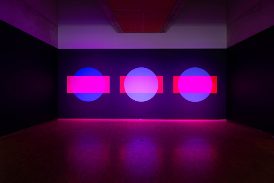
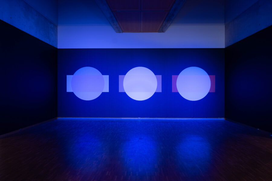
Haggerty Museum of Art, Marquette University, Milwaukee, WI, August 31st – December 21st 2024
What defines common decency, truth, fact or fiction, and even cultural or national identity is changing. Voices expressing intolerant views and protectionist values have more visibility in politics and media. For a variety of reasons, many people around the world feel distress, and the tools we have used to bring relief before, seem to be failing. The rules of engagement for relating to each other and the natural world are changing.
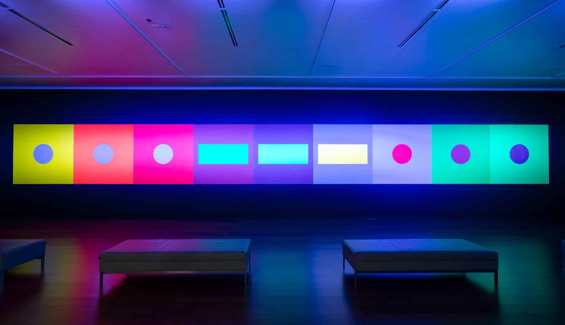
As an artistic duo that explores the physical and psychological effects of color, Luftwerk know that color theory, while rule-bound, is highly personal. Their large-scale, site-specific installations using projected video to explore relationships between material, form, and light maintain a strong focus on the subjective, which highlights the fleeting and context-specific nature of visual experience. In “Color Code,” they expand that inquiry by investigating color as a system of language and symbols, and a marker of emotion.
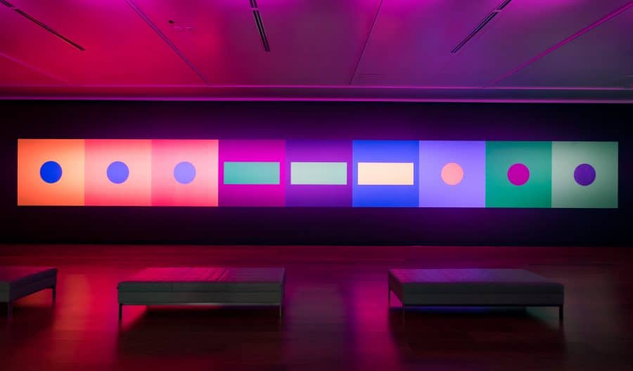
Drawing on Goethe’s interpretation of color theory, “Color Code” consists of nine paintings—six-feet-by-six-feet colored squares—applied to the gallery’s walls. The paintings, using the International Morse Code system of dots and dashes to spell out “SOS,” are configured with a variation on complementary color patterns, creating a playful visual excursion. In this pattern, the color scheme maintains the consistency of complementary colors, but in a softer, more harmonious manner. Modest lightbox sculptures that mimic the code’s dashes, feature circular panels backlit by color shifting lights.
In Goethe’s theory of color, different hues carry a physical and mental charge for the viewer. Yellow, for example, is imbued with brightness and joy, while red suggests grace and attractiveness, and might evoke feelings of dignity or gravity in a spectator. Goethe also thought of darkness as more than the absence of light, instead considering it an important component to provoking certain emotions. Black, for Goethe, was not simply the absence of color, but a color itself, and accordingly, the gallery walls have been transformed into a black canvas for “Color Code.”
When wireless radiotelegraph machines were introduced on merchant ships in the early 1900s, sailors finally had a way to signal distress and attract attention if needed. Initially, each country had its own distress signal for its fleet, causing confusion in critical moments. Not everyone could understand or recognize the message encoded in the transmitted sound. When the international distress signal “SOS” was adopted in 1908, its easily recognizable and unique code—no other symbol uses more than eight elements—produced aural unity, a sense of calm in life-or-death situations. As “SOS” began to be incorporated into popular culture, it took on textual inference, such as “Save Our Souls,” “Save Our Ship,” or even “Save Our Succor.” Visually, the pattern forms the letters S (three dots) O (three dashes) S (three dots) allowing it to remain an effective visual distress signal, an ambigram that can be read upside down or right side up. As the world adjusts to new norms in challenging times, re-considering how language, objects and symbols, and even color can help us find stable ground and safety no matter where we are. – Lee Ann Norman
- Curator, Director
- Justin Witte @ CCMA, John McKinnon @ The Haggerty
- Writer
- Lee Ann Norman
- Wall painting
- Stephen Reynolds, Stephen Monkemeier
- Photography
- Peter Tsai, Myrica von Haselberg
Color Code, 2017
Black wall, fluorescent paint, RGB LED
Color Code 2024
Black wall, acrylic paint, RGB LED


